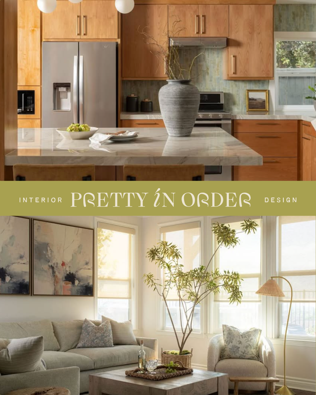
Pretty in Order’s physical work was defined by organic warmth and meticulous structure, but their digital footprint lacked a unified system to communicate their full-service capabilities. The firm needed to transition from their well-established roots in home organization into a comprehensive interior design and remodel company—all while expanding their reach to clients in North County and beyond. The core challenge was figuring out how to elevate their brand authority and introduce large-scale renovation services without losing the approachable, relationship-driven trust they had built over the past five years.
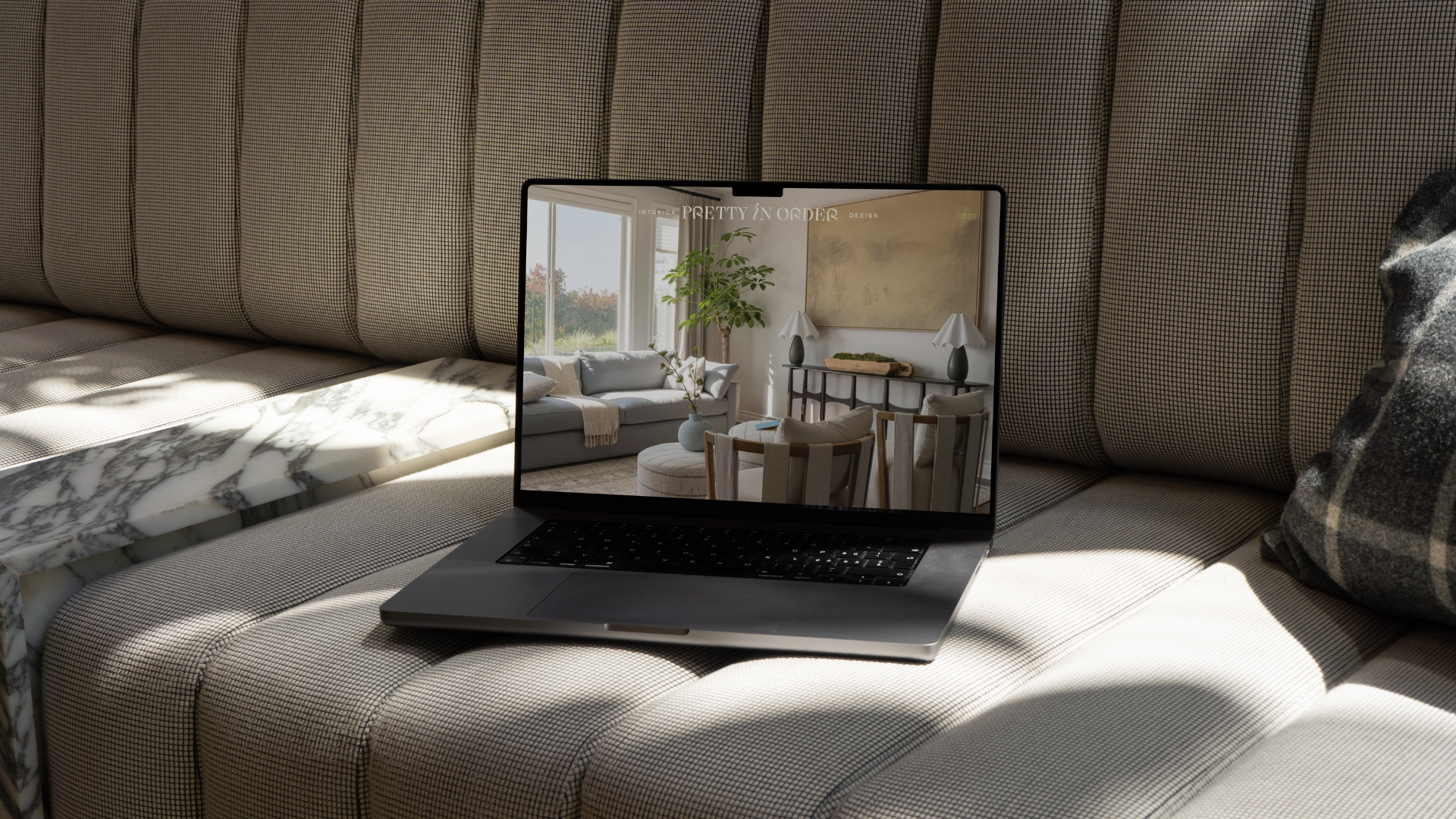
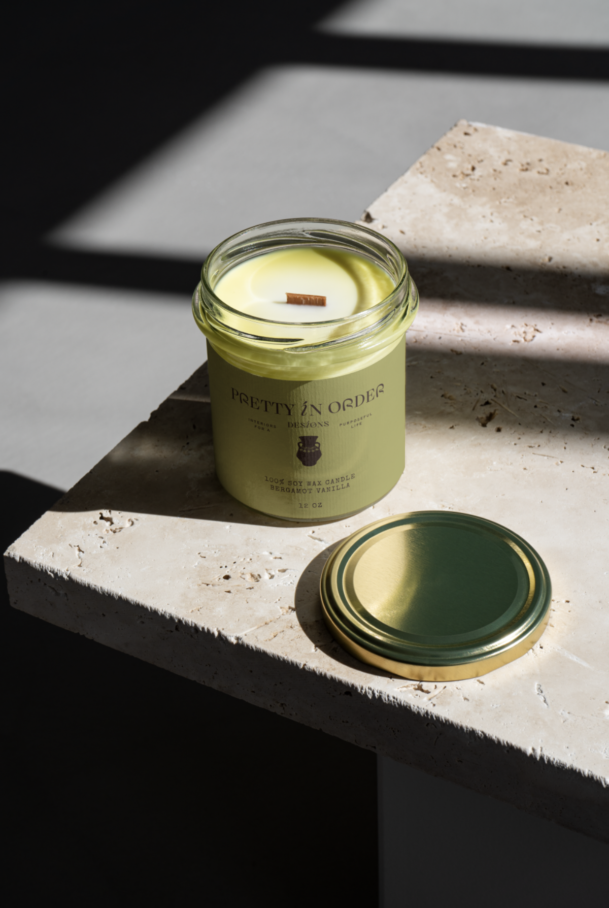
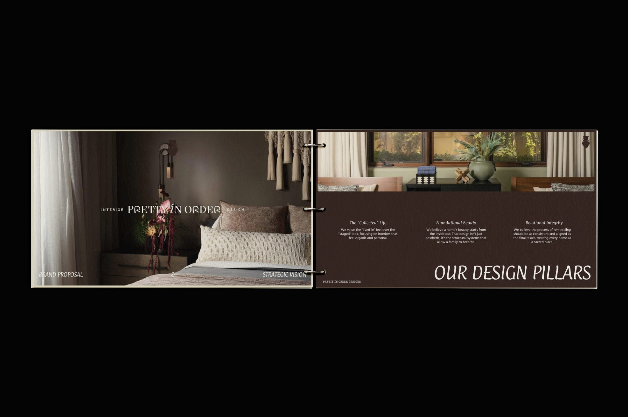
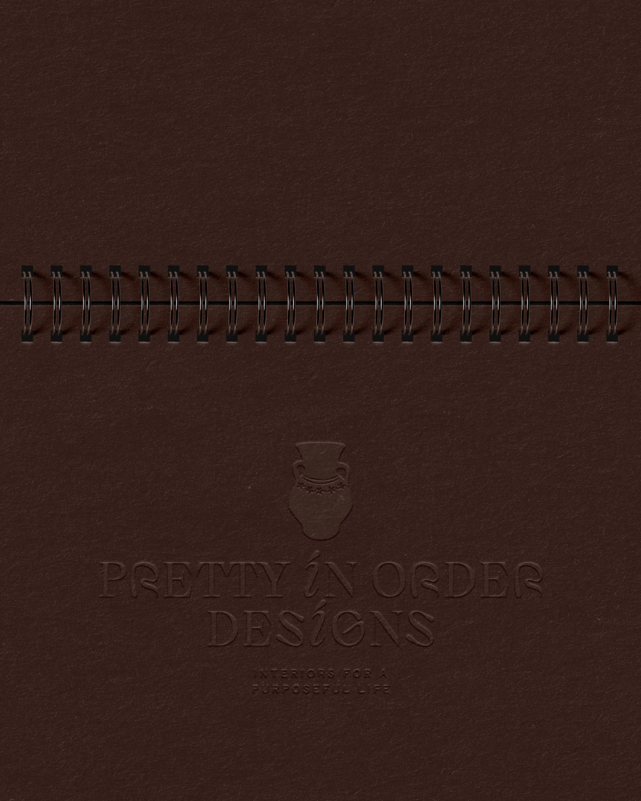
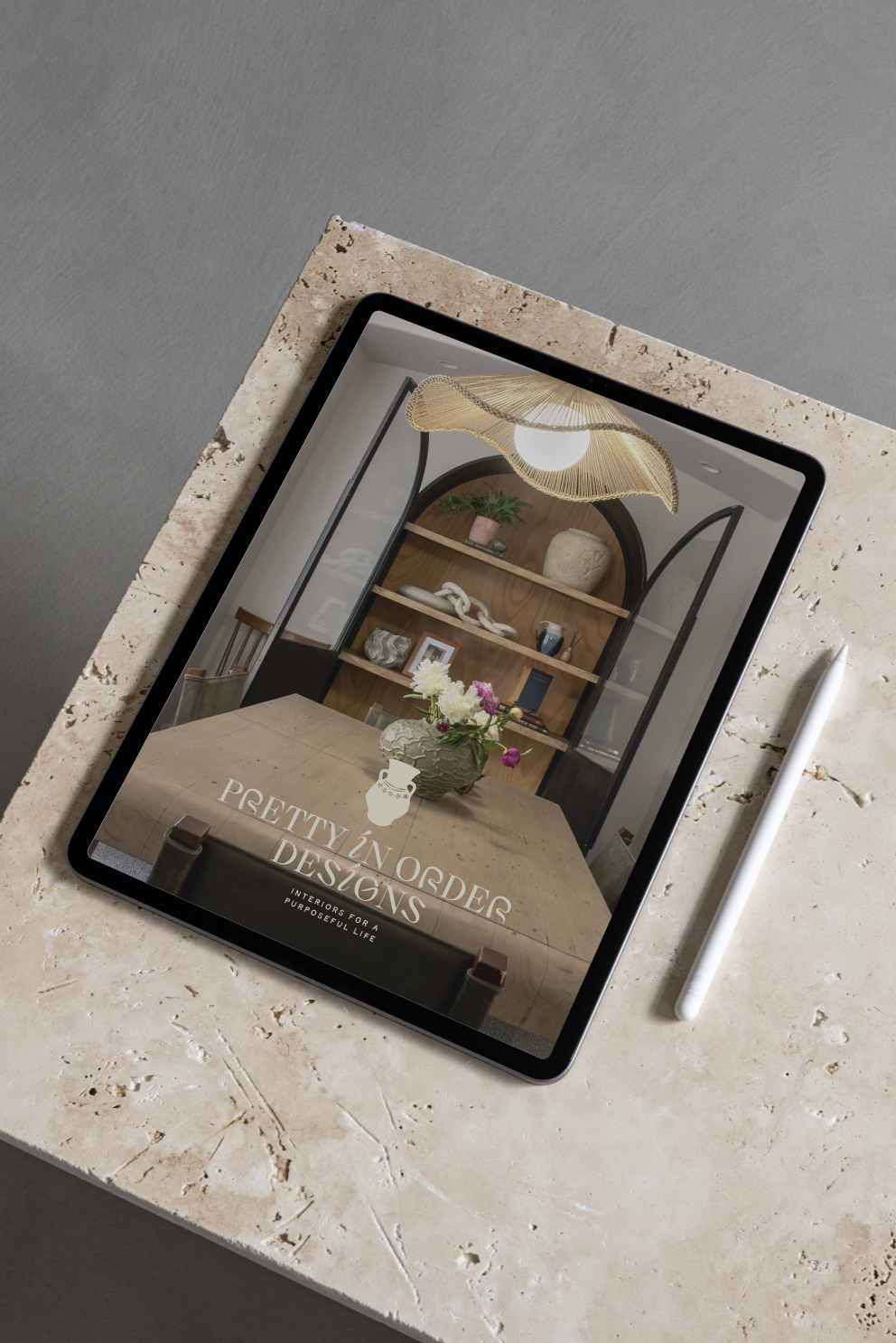
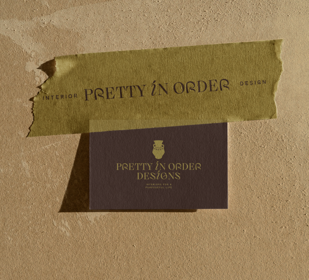
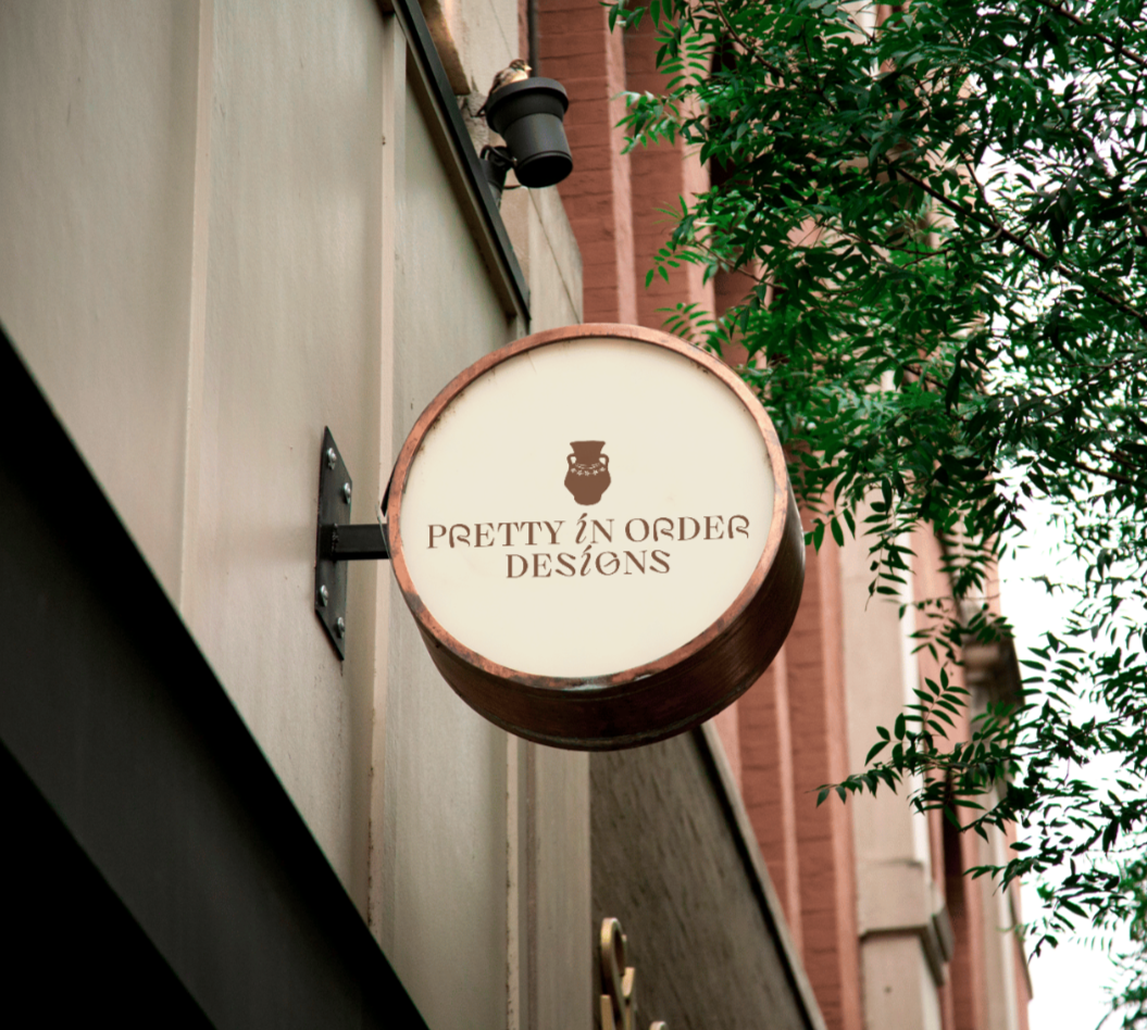
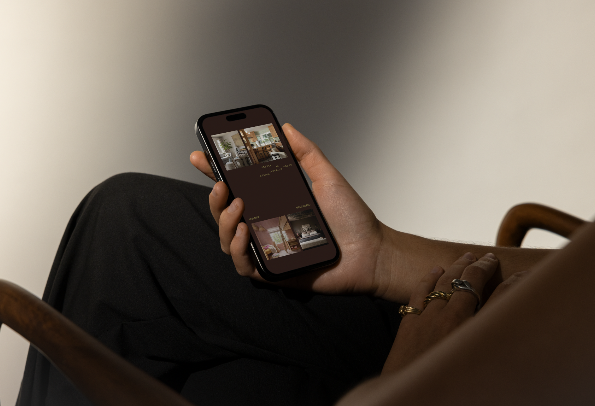
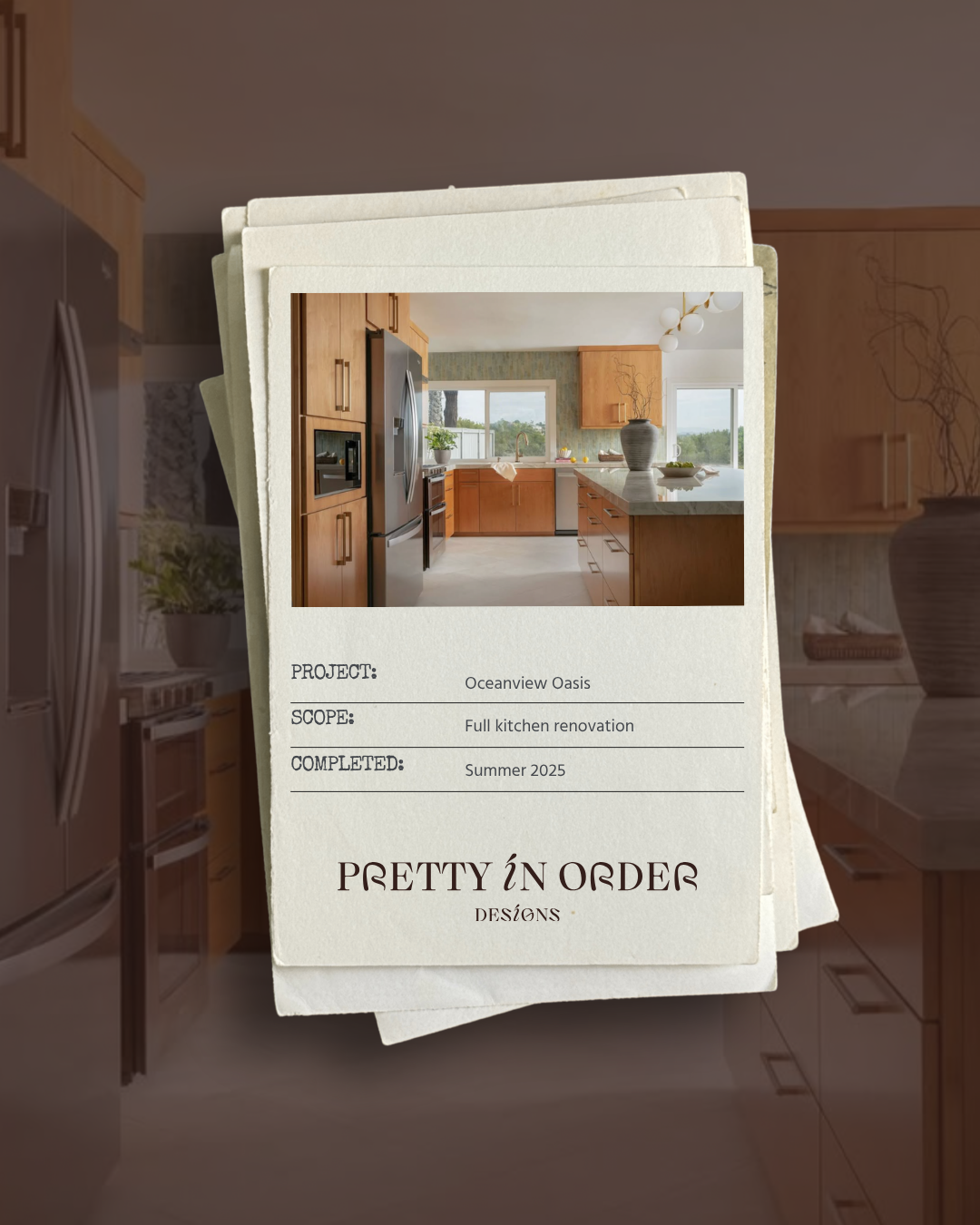
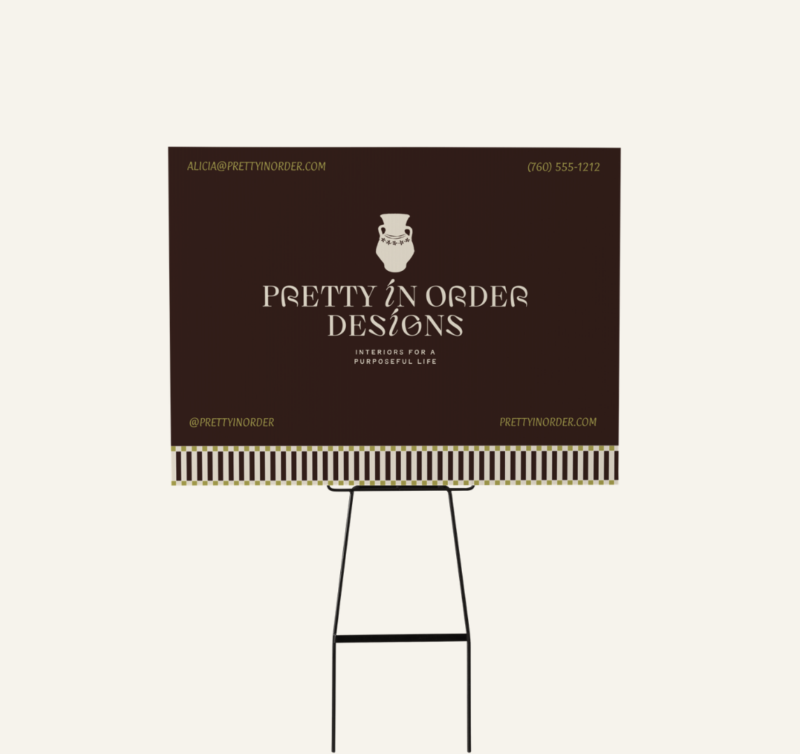
To bridge this gap, Grandview Collective delivered a strategic brand identity and asset solution centered around an "inside-out" design philosophy. By pairing an elegant, high-contrast serif typeface with a hand-sketched "Artisan Vessel" icon, we created a visual narrative that honors both timeless heritage and functional systems. This new framework organizes their multi-layered services into a cohesive, high-end "one-stop-shop" story, equipping the boutique husband-and-wife team with the professional authority and tangible tools needed to turn overwhelmed visionaries into lifelong clients.
Brand Strategy
Brand Identity
Signage Design
Social Media Design
Service Brochure Design